Content Management
Upload and manage digital assets
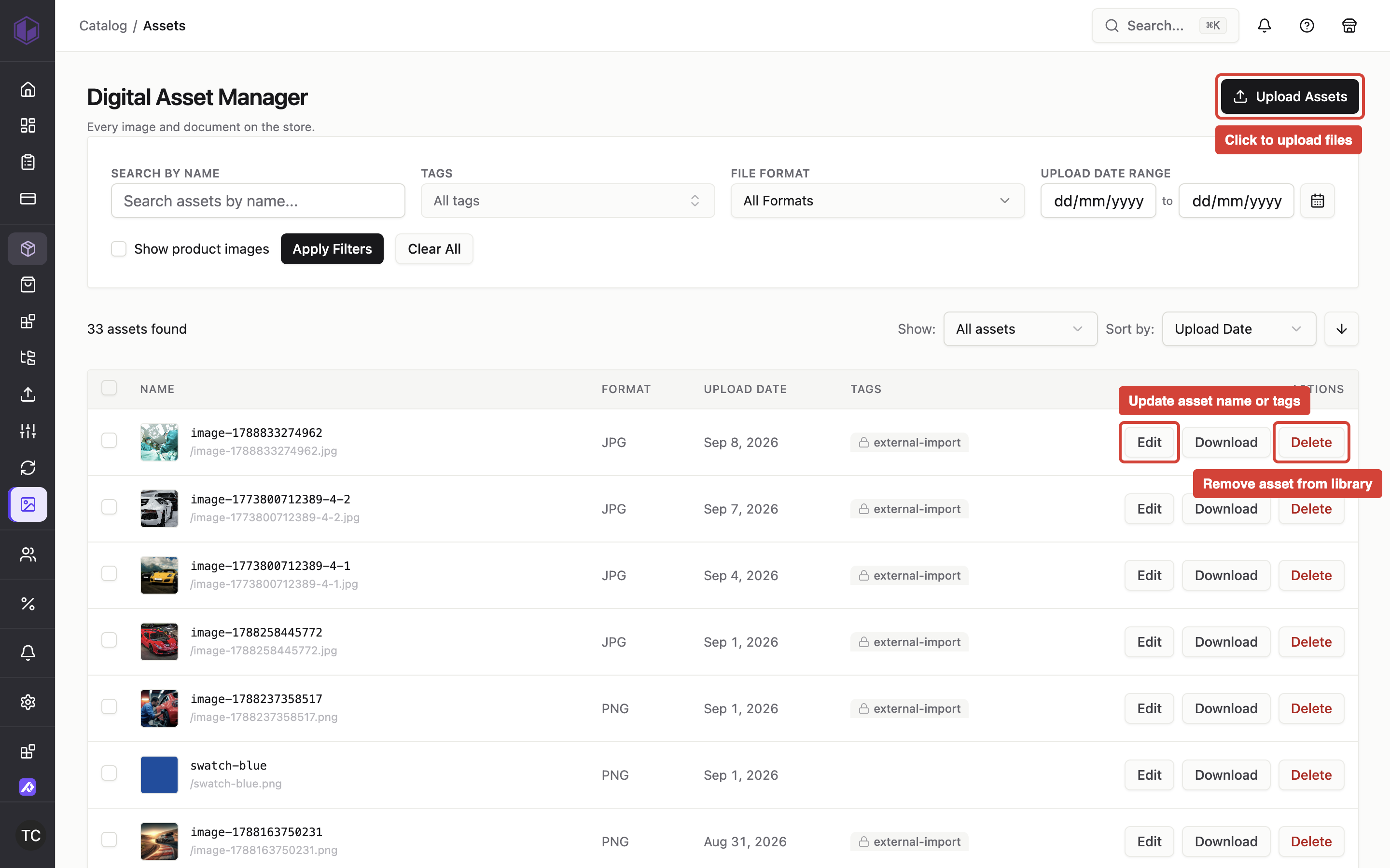
Where to find it: Admin → Assets
When you'd use this: When you need to add images and other files to your store's asset library for use in products, pages, banners, and other content. The Digital Asset Manager lets you upload, organize, edit, and delete assets from a central location.
Using it day-to-day:
To upload assets:
- Navigate to Admin → Assets
- Click the upload button to select one or more files from your computer
- The files upload to your store's asset library and appear in the asset list
- Each asset is stored with its name, file format, and upload date
To view and manage assets:
- Open the asset list to see all uploaded files with their name, format, and upload date
- Click the edit action to update an asset's name or tags for better organization
- Click the download action to save a copy of the asset to your computer
- Click the delete action to permanently remove an asset from your library—a confirmation dialog appears to prevent accidental deletion
Asset names must be unique across your store and should use lowercase letters and hyphens for readability. When you rename an asset, the system updates the file name in storage to match.
The Digital Asset Manager supports a wide range of file formats including PNG, JPEG, WebP, GIF, BMP, TIFF, SVG, ICO, AVIF, and HEIC/HEIF files.
Troubleshooting:
- Asset name won't save when editing — Asset names must be unique. Check if another asset already uses that name, or try a different name.
Tag assets with guided suggestions
Where to find it: Admin → Assets (edit an asset)
When you'd use this: When organizing assets for use in tag-driven features like the Documents block and Assets display block. Tags help you group assets by product, category, customer, region, country, warehouse, document type, product attributes, or custom labels. The guided picker suggests the correct format and lets you search your catalogue, ensuring assets match when needed.
Using it day-to-day:
To add tags to an asset:
- Navigate to Admin → Assets and click the edit action on an asset
- Click the tag field to open the tag picker
- See existing tags from your store grouped by domain (product, category, customer, region, country, warehouse, doctype, product attributes, and other) with usage counts
- Type 2 or more characters to search your store's tags and browse suggestions from your catalogue:
- Products appear as
item code · descriptionand create tags likeproduct:90042 - Categories appear as
name · b2b+b2c · pathand create tags likecategory:123 - Customers appear as
code · nameand create tags likecustomer:ACME - Warehouses appear as
code · nameand create tags likewarehouse:WEST - Locations appear as
state · region, countryand create tags likeregion:WA - Countries appear as
nameand create tags likecountry:AU - Product attributes appear as
field name · valueand create tags likebrand:Nike
- Products appear as
- Select a tag to add it to the asset
- Create custom tags by typing your tag text and selecting the "Create" option at the end of the list
- Remove tags by clicking the × on any tag chip
- Save your changes
The picker groups suggestions by domain and shows which tags are already applied with a checkmark. Already-used catalogue items remain visible in search results so you can still find them by description. System-reserved tags (like logo, productImage:, or external-import) cannot be created manually and appear with a lock icon.
Tag domains follow the domain:value naming convention to match tag-driven storefront features. Categories search across both B2B and B2C scopes—when a category ID exists in both, the picker shows one row labelled with both scopes (like Chairs · b2b+b2c · Home / Furniture) and creates a single tag.
For product attributes, the domain is the custom field's name (lowercased and slugged, such as Brand → brand or Country of origin → country-of-origin), and the value is the attribute value exactly as stored on the item. When you select a product attribute value from the picker, the tag is written automatically with the correct domain and value—you never have to know the case rules.
Troubleshooting:
- Can't create a custom tag — Some tags are reserved by the system and cannot be created manually. Try a different tag name or select a suggested tag from the picker.
- Selected product doesn't appear in the list — If the product tag is already applied to the asset, it shows a checkmark in search results. Remove the tag and re-add it if needed.
Add or remove tags on multiple assets at once
Where to find it: Admin → Assets
When you'd use this: When you need to update tags on several assets at once, such as when labelling rules change or you need to apply the same tags to a batch of related documents. Bulk tag editing lets you add or remove tags across a selection without opening each asset individually.
Using it day-to-day:
To select assets for bulk editing:
- Navigate to Admin → Assets
- Use the checkboxes in the asset list to select assets you want to update
- You can select multiple assets across the current page
- Product image assets cannot be selected for bulk editing—they follow the same edit restrictions as individual asset editing
- The bulk action bar appears above the table showing how many assets are selected
To add tags to selected assets:
- Click Edit tags in the bulk action bar
- The bulk tag editor opens with Add and Remove sections
- In the Add section, use the tag picker to select tags you want to add
- The tag picker works the same way as the individual asset editor—search for existing tags, browse products, warehouses, regions, or create custom tags
- Selected tags appear as chips in the Add section
- Click Apply to add the tags to all selected assets
To remove tags from selected assets:
- Click Edit tags in the bulk action bar
- In the Remove section, see tags that the selected assets actually carry
- Each tag shows how many of the selected assets have it (for example, "on 3 of 5")
- Toggle the checkbox next to tags you want to remove
- Click Apply to remove the checked tags from assets that carry them
- If an asset doesn't have a tag you're removing, it stays unchanged—this isn't treated as an error
To apply both adds and removes together:
- Select tags to add and tags to remove in the same dialog
- If you select the same tag in both sections, the add takes priority—the tag will be present on all selected assets after applying
- Click Apply to update all selected assets in one operation
After applying changes:
- A message appears showing how many assets changed and whether any updates failed
- Assets that already carry the requested end state are skipped—no unnecessary updates are made
- If some assets fail to update, the successfully changed assets stay changed
- You can retry failed updates by keeping the selection and clicking Edit tags again
- Click Clear in the bulk action bar to deselect all assets
The system protects reserved tags—you cannot add system tags like logo, productImage:, or external-import through bulk editing, and remove operations never touch system tags even if you try to remove them.
Selections are cleared automatically when you change pages, sort, or filter the asset list—this ensures you're always working with assets you can see on screen.
Troubleshooting:
- Selected assets disappear after changing filters — The selection is cleared when you navigate to a different page or apply filters. This is intentional to prevent accidentally editing assets you can't see. Apply your filters first, then select assets from the filtered results.
- Can't select a product image asset — Product image assets are not editable individually and cannot be included in bulk operations. Select only regular assets for bulk tag editing.
- Tag appears in both Add and Remove but ends up present — When the same tag is selected for both adding and removing, the add takes priority. All selected assets will have the tag after applying.
- Apply says "Nothing to change" — All selected assets already carry the exact tags you're trying to add, or none of them carry the tags you're trying to remove. The system skips unnecessary updates to keep timestamps accurate.
Filter and search assets
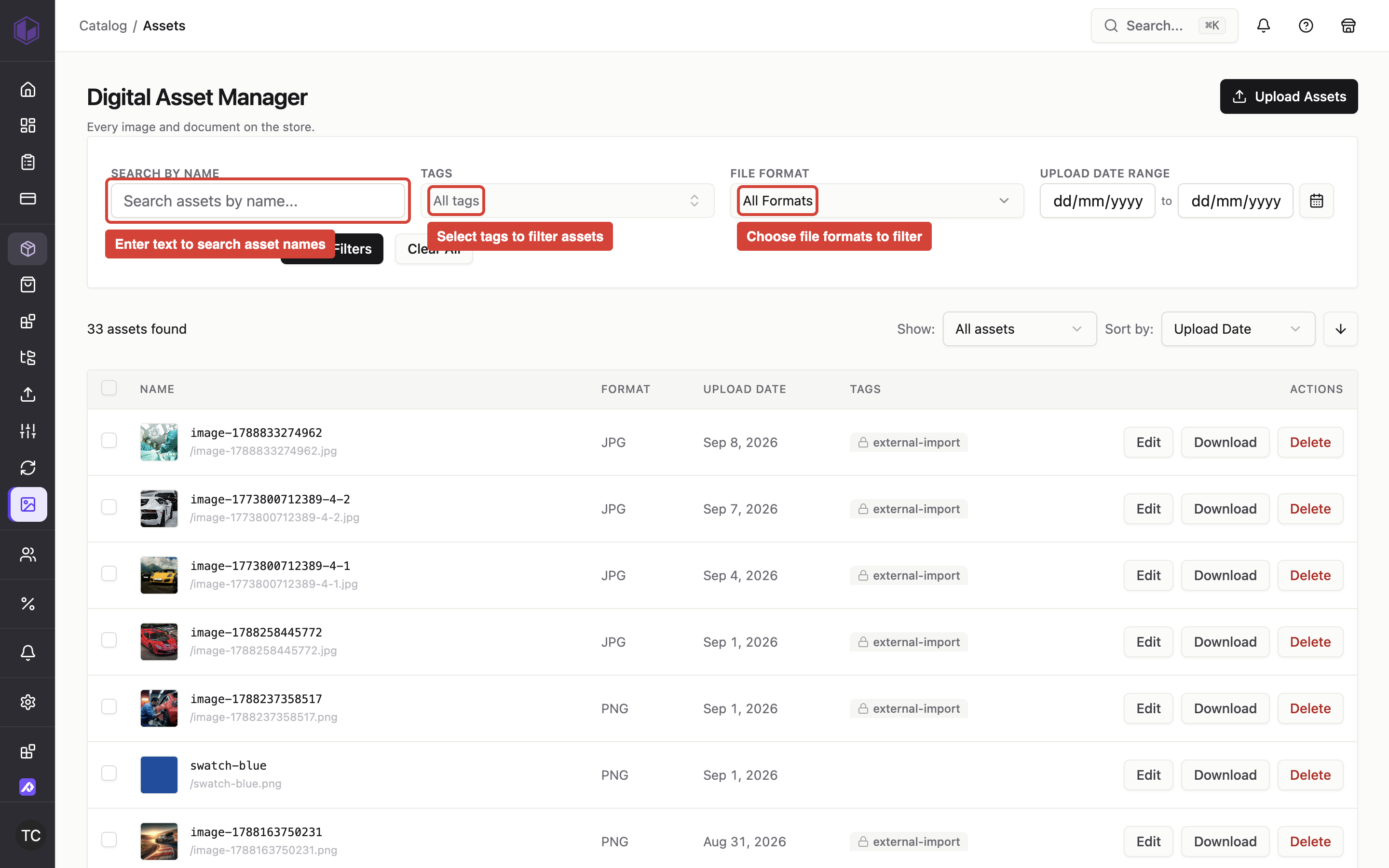
Where to find it: Admin → Assets
When you'd use this: When you need to quickly find specific assets within large collections by searching names, filtering by tags, file formats, or upload dates. Filters can be combined to narrow down results.
Using it day-to-day:
To search by asset name:
- Navigate to Admin → Assets
- Enter text in the search field
- The asset list updates to show only assets whose names contain the search term (case-insensitive)
To filter by tags:
- Select one or more tags from the tag filter
- The asset list shows only assets that have at least one of the selected tags
- Clear tag filters to show all assets again
To filter by file format:
- Select one or more file formats from the format filter (JPEG, PNG, GIF, PDF, SVG, etc.)
- The asset list shows only assets matching the selected formats
To filter by upload date:
- Use the date range picker to select a start date and end date
- The asset list shows only assets uploaded within that date range (inclusive)
To sort assets:
- Choose a sort field: date uploaded, name, or file format
- Choose the sort order: ascending or descending
- The asset list updates to reflect your sorting preference
Filters work together using AND logic—when you combine multiple filters (such as tags, formats, and date ranges), the asset list shows only assets that match all selected criteria. Filter selections persist during your session and are reflected in the URL, so you can bookmark or share filtered views.
Troubleshooting:
- No results appear after filtering — Make sure your filter combinations aren't too restrictive. Try removing one filter at a time to see which criteria are excluding your assets.
- Filter selections disappear after refreshing — Filters are saved in the URL. If you're using browser navigation or clearing your history, the filters will reset. Bookmark the filtered URL to preserve your filter state.
Browse and select images from the Digital Asset Manager
Where to find it: Admin → Assets or from any image selector in the CMS
When you'd use this: When you need to add images to products, pages, or other content in your store, you can browse and select from images you've already uploaded to your store's asset library.
What you need first: Images uploaded to your store's Digital Asset Manager
Using it day-to-day:
- Open any content editor that allows you to add images (such as product descriptions, pages, or banners)
- Click the image selector to open the Digital Asset Manager
- By default, the "My Images" tab displays images from your store's asset library
- Use the search field to find specific images by name
- Click on an image to preview it
- Select the images you want to use
- Click Close in the top right corner to copy the selected images to your content
When you select an image, the editor preserves your selection even if you search for other images or switch tabs. Your previously selected image remains visible in the editor until you explicitly choose a different image.
The Digital Asset Manager supports a wide range of image formats including PNG, JPEG, WebP, GIF, BMP, TIFF, SVG, ICO, AVIF, and HEIC/HEIF files.
Troubleshooting:
- Images don't appear in the selector — Make sure the files are uploaded to your store's asset library first by visiting Admin → Assets
- Selected image disappears when searching — The editor preserves your image selection while you browse. If your image still disappears, refresh the page and try selecting the image again.
Upload images directly from the CMS
When you'd use this: When editing pages or content in the CMS, you can upload images directly to your store's asset library without leaving the editor. The upload interface appears within the image selector for quick access.
Using it day-to-day:
- Open any content editor that allows you to add images
- Click the image selector to open the Digital Asset Manager
- Navigate to the "My Images" tab
- Click the upload button to select one or more image files from your computer
- The files upload to your store's asset library
- Once uploaded, the images appear in your "My Images" list and are ready to select and use in your content
Uploaded images are stored in your store's asset library and can be reused across products, pages, banners, and other content. You can also manage these assets later by visiting Admin → Assets.
The content manager supports a wide range of image formats including PNG, JPEG, WebP, GIF, BMP, TIFF, SVG, ICO, AVIF, and HEIC/HEIF files.
Upload a logo in theme settings
Where to find it: Admin → CMS → Theme Editor → Theme Settings
When you'd use this: When you need to set or update your store's logo and favicon. You can upload a logo image that appears in the header across your storefront and set a favicon that appears in browser tabs.
Using it day-to-day:
To upload a logo:
- Navigate to Admin → CMS → Theme Editor
- Open Theme Settings
- Locate the logo upload control
- Click the upload button to open the asset uploader
- Select an image file from your computer
- The logo uploads to your store's asset library and is automatically tagged as a logo
- The uploaded logo appears in the theme settings preview
- Adjust the logo width using the slider to control how large the logo appears in your store's header
- Save your theme settings to apply the logo to the live storefront
To upload a favicon:
- Open Theme Settings
- Locate the favicon upload control
- Click the upload button and select an image file
- The favicon uploads and appears in browser tabs and bookmarks when customers visit your store
- Save your theme settings to apply the favicon
To remove a logo or favicon:
- Open Theme Settings
- Click the remove button next to the logo or favicon control
- The preview updates to show the default placeholder
- Save your theme settings to clear the logo or favicon from the live storefront
The logo uploader uses the same asset uploader as other CMS image fields. Uploaded logos are stored in your asset library and tagged with "logo" for easier filtering. The logo width slider only applies when a custom logo is uploaded—the default logo keeps its natural sizing.
Changes you make in Theme Settings preview immediately in the editor so you can see how the logo will appear before saving.
Troubleshooting:
- Logo doesn't appear after uploading — Make sure you saved your theme settings after uploading the logo. Changes only apply to the live storefront after saving.
- Favicon still shows the default icon — Browser tabs cache favicons aggressively. Try clearing your browser cache or opening the store in an incognito window to see the updated favicon.
Add external images to your asset library
When you'd use this: When browsing stock images from services like Unsplash, Pexels, or Pixabay in the CMS, you can save external images directly to your store's asset library. This ensures images remain available even if the external source changes or removes them.
Using it day-to-day:
- Open the image selector in any content editor
- Browse images from stock image services (Unsplash, Pexels, or Pixabay)
- When you select an external image, the system downloads it and uploads it to your store's asset library
- The image is stored with a URL-friendly name and tagged as an external import
- The saved image appears in your "My Images" tab and can be reused across your store
The system handles the download and upload process automatically—external images are converted to local assets without requiring manual intervention. This protects your content from broken links if external services remove or modify images.
Troubleshooting:
- External image won't save — Some image services may block automated downloads. Try selecting a different image or uploading the image manually by downloading it to your computer first, then using the upload button in "My Images."
- Image appears in content but not in My Images — If you selected the image before it finished uploading, refresh the "My Images" tab to see the newly saved asset.
Add custom HTML and product fields to pages and product tabs
Where to find it: Admin → CMS → Theme Editor (when editing pages, product tabs, or content blocks)
When you'd use this: When you need to display custom product information such as fitment tables, technical specifications, or formatted content stored in product custom fields. Content blocks like Product Tabs, Text, Custom HTML, Heading, Product Info, Category Header, and Product Card support dynamic product fields that render formatted content including tables and lists.
Using it day-to-day:
To add a product custom field to a content block:
- Open the Theme Editor and navigate to a page or
Add background videos to sections
When you'd use this: When building pages in the CMS, you can add background videos to sections to create dynamic, engaging content. Background videos can come from uploaded files, stock video libraries (Pexels, Pixabay), or YouTube URLs.
Using it day-to-day:
- Select a section in the CMS editor to open its settings panel
- Click the background control and select the Video tab
- Choose your video source:
- Stock Videos: Browse videos from Pexels or Pixabay by searching or selecting from the library
- URL: Paste a direct video URL (MP4, WebM) or YouTube URL (including YouTube Shorts)
- For stock videos, click a thumbnail to preview and select the video
- For YouTube videos, the embed automatically loops, mutes, and autoplays with controls hidden
- For direct video files, configure playback settings:
- Toggle autoplay, loop, muted, and controls as needed
- Adjust how the video fits within the section using the object-fit control (cover, contain, fill)
- The video plays as a full-section
Control section backgrounds and image overlays
When you'd use this: When building pages in the CMS, you can add background colors or images to sections and control the opacity of image overlays. This lets you create visual hierarchy and ensure text remains readable over background images.
Using it day-to-day:
- Select a section in the CMS editor to open its settings panel
- Click the background control to choose between a solid color, an image, or a video
- For background colors, use the color picker to select your desired color
- For background images, click to browse your asset library and select an image
- When using a background image, click the image thumbnail to adjust the image overlay opacity using the slider
- Adjust how the image fits within the section (cover, contain, fill) and its position (top-left, center, bottom-right, etc.)
- The background settings apply to the entire section across all viewports
The background and overlay controls provide a thumbnail preview of your selected image, making it easier to see what you're adjusting. When you switch between different media sources or search for new images, your previously selected background image remains in place until you explicitly choose a different one.
Control block backgrounds, appearance, and spacing
Where to find it: Admin → CMS → Theme Editor (block settings panel)
When you'd use this: When building pages in the CMS, you can add background colors or images to individual content blocks and control their appearance and spacing. This lets you create visual hierarchy within sections, highlight specific content, or build complex layouts without adding extra sections.
Using it day-to-day:
To add background colors or images to blocks:
- Select a block in the CMS editor to open its settings panel
- Click the background control to choose between a solid color or an image
- For background colors, use the color picker to select your desired color
- For background images, click to browse your asset library and select an image
- When using a background image, adjust the image overlay opacity using the slider
- Adjust how the image fits within the block (cover, contain, fill) and its position
To control block appearance:
- Select a block in the CMS editor to open its settings panel
- Click the appearance control to adjust visual styling
- Set a color scheme for the block, or choose "inherit" to follow the section's color scheme
- Add box shadows or borders to visually separate the block from surrounding content
To adjust block spacing:
- Select a block in the CMS editor
- Click the spacing control to adjust padding (inner spacing) and margin (outer spacing)
- Adjust padding to control space between the block's border and its content
- Adjust margin to control space between the block and neighboring blocks
- Toggle between "All sides" and "Per side" to apply uniform spacing or customize each edge independently
Background, appearance, and spacing settings are available on most content blocks (such as headings, text, images, product cards, and order information). Utility blocks like navigation items, breadcrumbs, and logos offer spacing controls only to avoid visual clutter.
All settings are independent from the section's background and styling, so blocks can have their own visual identity within a section.
Troubleshooting:
- Block background doesn't appear — Make sure the block has content or minimum dimensions set. Empty blocks with no padding may not display backgrounds visibly.
- Block appearance settings are missing — Some utility blocks (navigation items, breadcrumbs, logos) only offer spacing controls. Content blocks like headings, text, and images have full background and appearance settings.
Add feature cards with hover effects and links
Where to find it: Admin → CMS → Theme Editor (add a Feature Card block)
When you'd use this: When you want to create engaging, interactive cards on your pages that reveal additional content or swap images when customers hover over them. Feature cards can link to product pages, collections, or any other page in your store.
Using it day-to-day:
To add a feature card:
- Open the theme editor and navigate to the page you want to edit
- Add a Feature Card block to your section
- Select the block to open its settings panel
- Switch between the Default and Hover tabs to configure what appears in each state
To configure the default state:
- Select the Default tab in the settings panel
- Choose an image from your asset library
- Adjust how the image fits within the card (cover, contain, fill) and its position
- Add text elements and buttons using the elements editor
- Adjust vertical alignment to position content at the top, center, or bottom of the card
- Enter a link URL—the first visible button's link is used as the card link, or you can set a fallback link for the entire card
To configure the hover state:
- Select the Hover tab in the settings panel
- Choose a reveal layout:
- None: No hover effect (card remains static)
- Caption: Content appears below the image on hover
- Overlay: Hover content fades in over the image
- Optionally select a different hover image—when set, the hover image crossfades over the default image on any layout
- Add hover-specific text and buttons in the elements editor
- Configure motion effects (zoom, lift, scrim) to add subtle animation on hover
- Adjust overlay color, opacity, and direction for overlay layouts
- Set vertical alignment for hover content to position it at the top, center, or bottom
To customize content and spacing:
- Add and arrange text and button elements in the elements editor
- Text elements support rich formatting including headings and body text
- Button elements can use different styles (solid, soft, outline) and button scheme designs
- Adjust spacing between elements using the